In the restaurant business, every little thing is important, so it is necessary to put a certain meaning into the most insignificant and ordinary thing. The menu plays a huge role in the semantic, gastronomic and social concept of the establishment, so it simply has no right to be written on the knee. The list of dishes, color design and even the font must be carefully thought out by a team of professionals and have their own features. We will talk about the most common and effective ones in this article.
Magic number 7±2
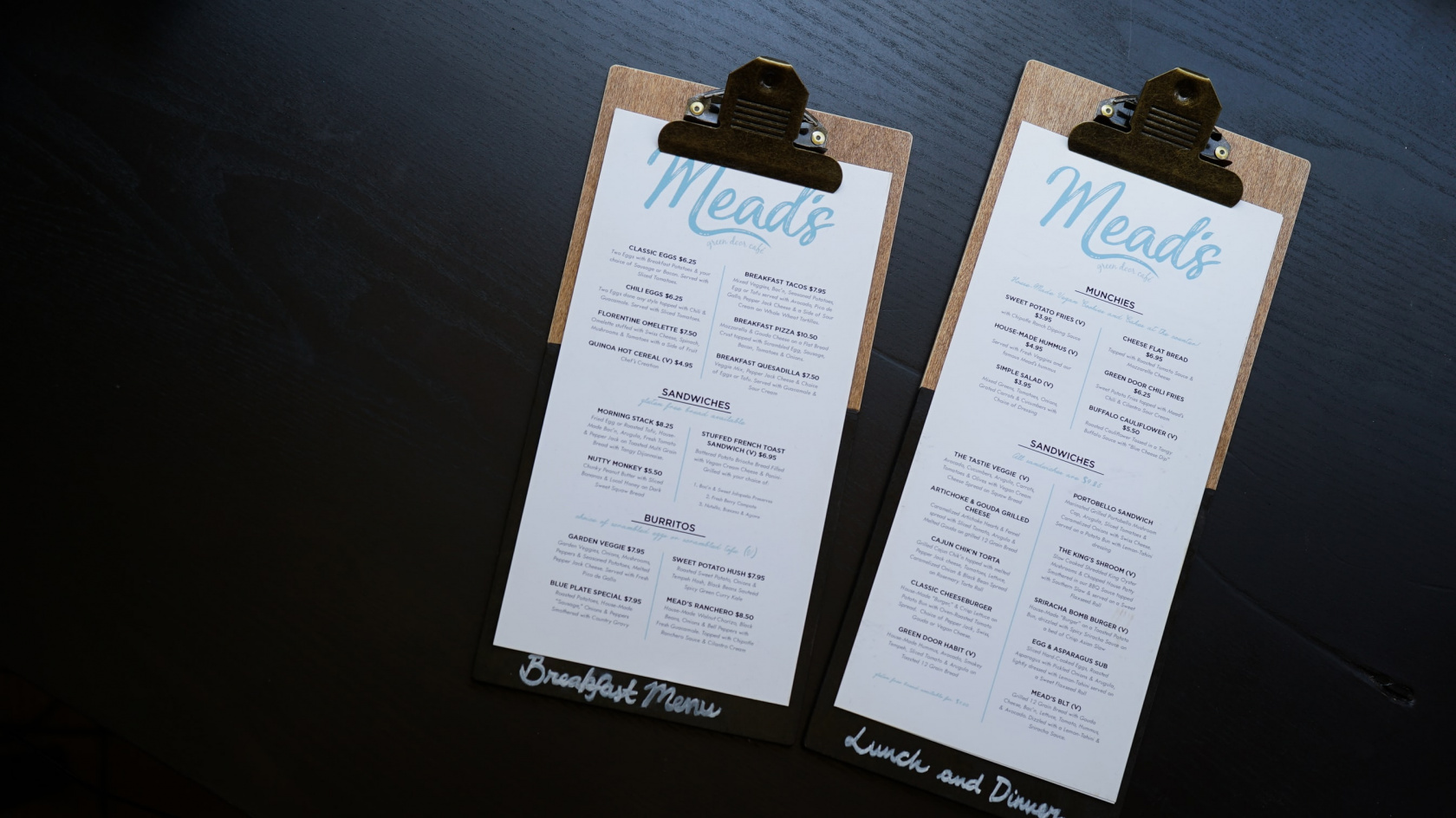
Perhaps one of the most famous tricks is the rule of the “magic number 7±2”. This is a pattern that was brought out by the American psychologist George Miller. According to it, short-term human memory cannot remember and reproduce more than 5-9 elements. Based on this principle, consciously or intuitively, many chefs add about 7 items to each section of the menu so as not to complicate the guest’s choice. Visiting a restaurant most often means relaxing, so if a guest begins to get confused about the variety of dishes, most likely he will choose something standard. A menu designed according to George Miller’s principles will make it easier for guests to decide to try something new and enjoy a previously unknown taste.
Name of the dish
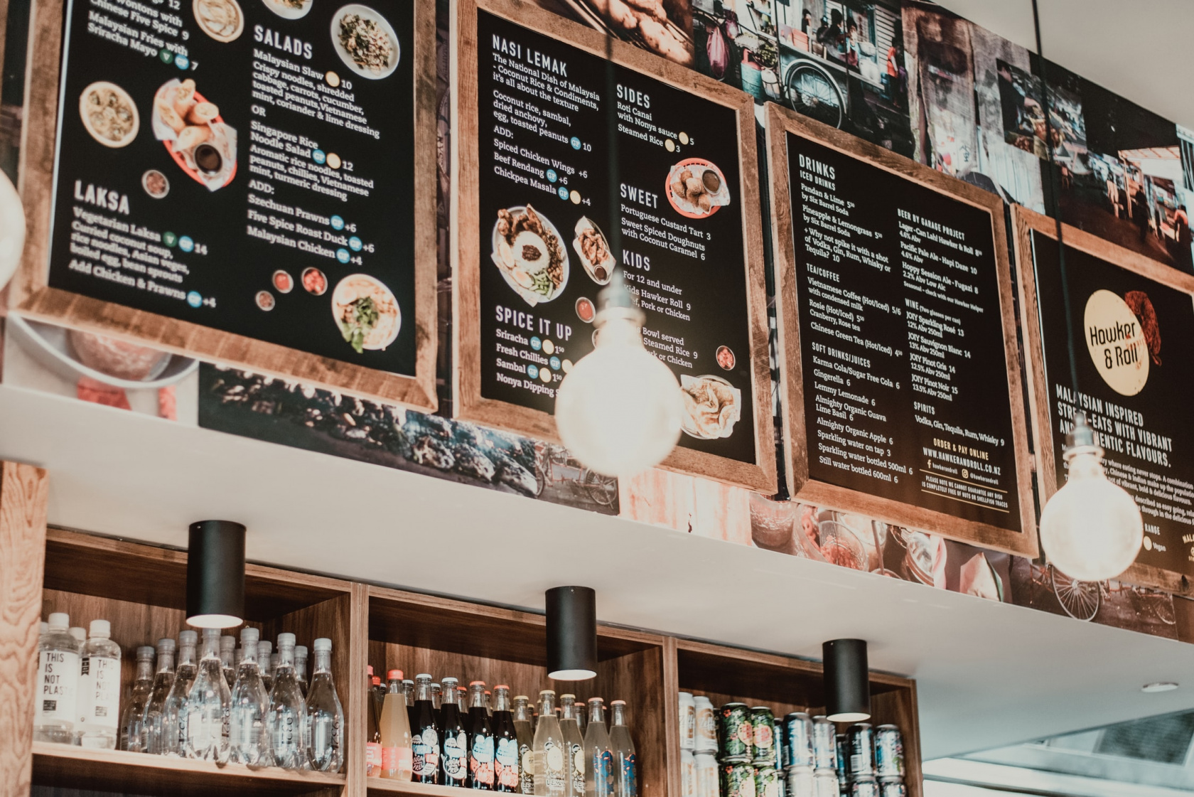
The purchaseability of dishes may be influenced by their name. Dishes with longer names are ordered 30% more often than dishes with short names. A detailed description of the dish creates the effect that the guest perceives the price-quality ratio as more favorable compared to other items. It seems to him that a portion of “home-style spicy lamb ribs” will be larger and tastier than a portion of ordinary “lamb ribs.” This technique is so effective that in some US states it is prohibited to give false descriptions to dishes. This is especially true for phrases like “hand-caught,” “farmed,” “made with local ingredients,” etc.
Color
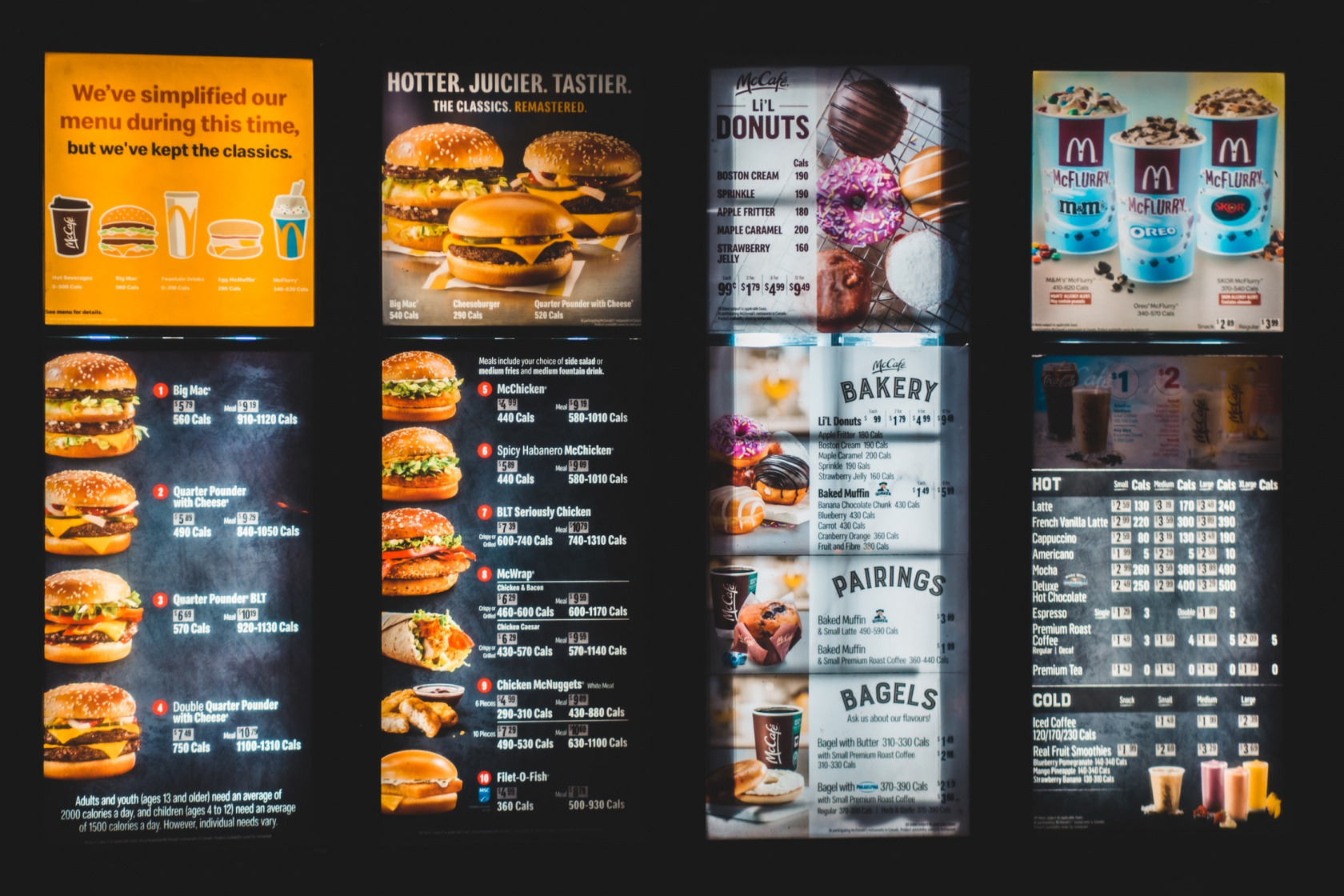
Naturally, menu designers never ignore the importance of color scheme, since the human psyche reacts very sharply to color and its shades. The fact that yellow and red colors increase appetite is known to almost everyone, including entrepreneurs. That is why these two colors are found in large quantities in the corporate design of restaurants.
Tradition and nostalgia
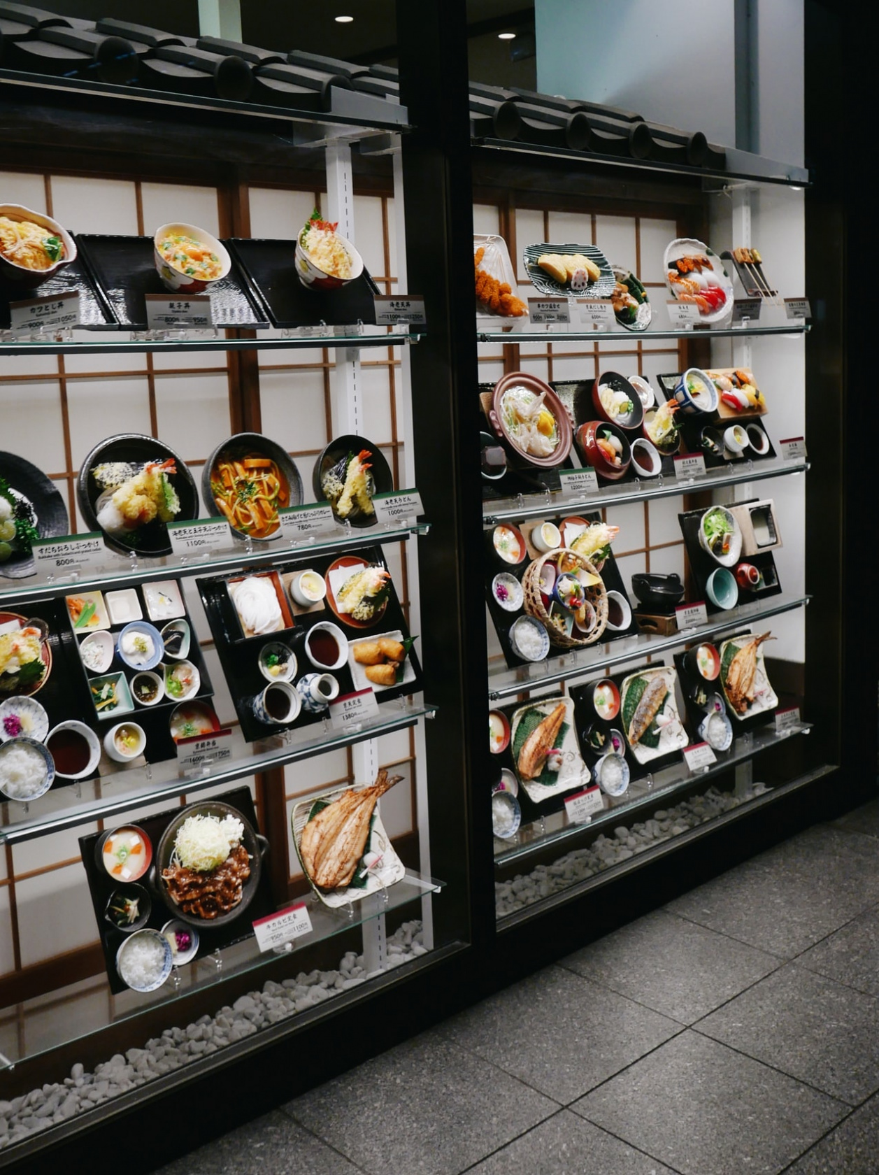
The next trick doesn't seem so obvious anymore: restaurant menus often focus on a sense of nostalgia. The guest is very pleased to think that he is eating a traditional dish that is no longer made anywhere. The names of dishes may contain phrases whose purpose is to remind us of childhood and youth: “Apple pie like grandma’s.”
As we can see, there are many creative approaches to menu design. This is not surprising, because it is precisely this that, one might say, is the “face” of any establishment.














/https%3A%2F%2Fcomplexbar.com%2Fimages%2Fblog%2F58%2F555.jpeg)
/https%3A%2F%2Fcomplexbar.com%2Fimages%2Fblog%2F246%2Fsirop_scale_2400.jpeg)
/https%3A%2F%2Fcomplexbar.com%2Fimages%2Fblog%2F246%2Fkofe-vostochniy.jpg)
/https%3A%2F%2Fcomplexbar.com%2Fimages%2Fblog%2F245%2Fpexels-jason-villanueva-851555.jpg)
/https%3A%2F%2Fcomplexbar.com%2Fimages%2Fblog%2F246%2F2024-04-09_17.22.54.jpg)
/https%3A%2F%2Fcomplexbar.com%2Fimages%2Fblog%2F246%2F2024-04-09_17.22.47.jpg)
/https%3A%2F%2Fcomplexbar.com%2Fimages%2Fblog%2F246%2FCODE_anons_foamydrops_752%D1%85480_eng.jpg)
/https%3A%2F%2Fcomplexbar.com%2Fimages%2Fblog%2F246%2FAlina_752%D1%85480_eng.jpg)
/https%3A%2F%2Fcomplexbar.com%2Fimages%2Fblog%2F246%2F2024-04-09_17.23.22.jpg)
/https%3A%2F%2Fcomplexbar.com%2Fimages%2Fblog%2F246%2F2024-04-09_17.23.28.jpg)
/https%3A%2F%2Fcomplexbar.com%2Fimages%2Fblog%2F246%2F2024-04-09_17.23.35.jpg)
/https%3A%2F%2Fcomplexbar.com%2Fimages%2Fblog%2F246%2Fdrinksome_752%D1%85480_eng.jpg)
/https%3A%2F%2Fcomplexbar.com%2Fimages%2Fblog%2F246%2Fnude_752%D1%85480_eng.jpg)
/https%3A%2F%2Fcomplexbar.com%2Fimages%2Fblog%2F246%2F752%D1%85480_eng__1_.jpg)
/https%3A%2F%2Fcomplexbar.com%2Fimages%2Fblog%2F246%2F752%D1%85480_eng.jpg)
/https%3A%2F%2Fcomplexbar.com%2Fimages%2Fblog%2F246%2FStudioRaw_752%D1%85480_eng.jpg)
/https%3A%2F%2Fcomplexbar.com%2Fimages%2Fblog%2F246%2FDoppio_tea_752%D1%85480_eng.jpg)
/https%3A%2F%2Fcomplexbar.com%2Fimages%2Fblog%2F246%2FTognana_Stars_Stripes_752%D1%85480_eng.jpg)
/https%3A%2F%2Fcomplexbar.com%2Fimages%2Fblog%2F246%2FRona_752%D1%85480_eng.jpg)
/https%3A%2F%2Fcomplexbar.com%2Fimages%2Fblog%2F246%2FDoppio_vending_752%D1%85480_eng.jpg)
/https%3A%2F%2Fcomplexbar.com%2Fimages%2Fblog%2F246%2FEssence_sukhie_smesi_752%D1%85480_eng.jpg)
/https%3A%2F%2Fcomplexbar.com%2Fimages%2Fblog%2F246%2FODK_sukhie_smesi752%D1%85480_eng.jpg)
/https%3A%2F%2Fcomplexbar.com%2Fimages%2Fblog%2F246%2Funiforma-barmena.jpg)
/https%3A%2F%2Fcomplexbar.com%2Fimages%2Fblog%2F246%2Fkak-nanyat-barmena.jpg)
/https%3A%2F%2Fcomplexbar.com%2Fimages%2Fblog%2F246%2Fsirop_scale_2400.jpeg)
/https%3A%2F%2Fcomplexbar.com%2Fimages%2Fblog%2F246%2FPeugeot_Anons_Paris_U%27Select_Line_Daman_752%D1%85480_eng.jpg)
/https%3A%2F%2Fcomplexbar.com%2Fimages%2Fblog%2F246%2Fkofe-vostochniy.jpg)
/https%3A%2F%2Fcomplexbar.com%2Fimages%2Fblog%2F246%2FMadler.jpg)
/https%3A%2F%2Fcomplexbar.com%2Fimages%2Fblog%2F246%2Fprofbartender_glavn.jpeg)